Tuesday, December 6, 2011

the difiference between hand drawing figures and digital figures

 
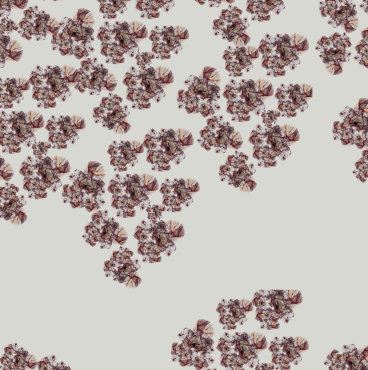
Left one figure is my hand drawing figure with my own designs. It was for the gap competition and I got the list for gap internship! During the digital class, I played around this figure with Illustrator and Photoshop. I scanned the fabric that I used for the gap competition and create the pattern with the Photoshop and   just placed that. I also use my prints that I did during the digital class before.
you can see that a lot of differences between theses two figures even though it's basically same figure with same design.
Which one do you like it more?


Tuesday, November 29, 2011

moodboard

for my integrated studio, my concept is about skyscraper building such as Hearst Tower.
It's located at 300 west 57th street, near Columbus Circle in NYC.
I inspired The Hearst Tower as Micro and Macro.
So I created mood board with some images of Hearst Tower.
My design will be very geometric and minimalism.
I will upload my designs soon!

Wednesday, November 16, 2011

drawing homework

Drawing class homework
(two opposite styles)

Process of The Jacket


For integrated studio(methods), we've been working on the jacket with simple sloper.
we supposed to include a knotted collar, facing and inter-facing.


I bought 2.5 yards of 100% dark brown wool and also 9 yards of black piping.
I used black piping in front, back and side seams.


I need to attach sleeves and also need to put lining & facing(fusible, tricot) 
It's kind of oversize two different colors shawl coat.

Close image for sleeves.

I found some of black fabrics that I used to use when I was taking FIT Summer Program in High school.
So I also put these fabrics to the sleeves ! and it came out really pretty!
I can't wait to see the Finish of the Jacket!
It's almost done! I just need to put lining.


Wednesday, November 9, 2011

drawing


perspective figure drawing.

woman's & children's collection for gap competition


Children's collection for gap.
finishes with flats.


Women's collection for gap
Finishes with flats.

swatch board for gap (woman&children wear)


This swatch board is for Children's wear

For woman's wear collection

inspiration for gap


This mood board is for gap children's wear.
I had woman's mood board too, but since I lost my USB AGAIN, I don't have it anymore.
basically, my women's wear theme was about "depression."
and otherwise, I also wanted to play with some of my design.
So I made some playful mood board with Keith Haring's work.

knit swatch


I made some knit watches for Gap competition.
These knits are for woman's wear.

Tuesday, November 1, 2011

more prints!


These prints were my second time to create some prints. I scarped some shape from my mood board (basically, it's knits and Jackson's painting) and changed some colors neutral ways

create Prints!


I inspired Ruth Batke's Paintings. Since my Design theme is about Vintage, I created some flower shape and then played around with Photoshop

Wednesday, October 19, 2011

prints!


This is what I found some shadow images from magazine.
I think it is very cool, so I used Photoshop to create some patterns for this images. 
When I created theses patterns, I really like it and I think it's really cool!
I love it!

croquis 2

This is my second time croquis for my ID class.
I used lots of neutral and dark colors, (black, dark brown and dark gray)
to show fall and winter.

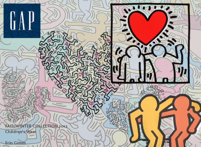
inspired by Kiss Haring for gap competition for children wears!


This is some of Keith Haring's art works.
He was an artist and social activist whose work responded to the NYC stress culture of the 1980s.
His bold lines, vivid colors, and active figures carry strong messages of life and unity.

I inspired a lot of his work and also thought that it will fun to make some patterns and prints using this images for children's wear!
I'm not fan of Illustrator, but I'll try to create prints and will upload very soon!

random images


stripes and plaids


Since I love neutral colors, I played with illustrator to create some simple stripes and plaids.

Tuesday, October 11, 2011

hand knitting!


I bought some yarns and it had some color mixed.


When I finished to make a knit swatch, I can see beautiful stripes since this yarn had color mixed.

random


Croquis


I scanned some croquis from my sketch book.
theses designs were inspired jackson pollock's painting in my own opinion.
Since I really love neutral colors, I put a lot of dark neutral colors and also put some prints on the design so people can see that I got inspired by Pollock's abstract painting.
  

process work


This is one of my process work. Before I designed something, I always put some images and my work(some swatch or painting) to my sketch book to show I inspired the original work very well.